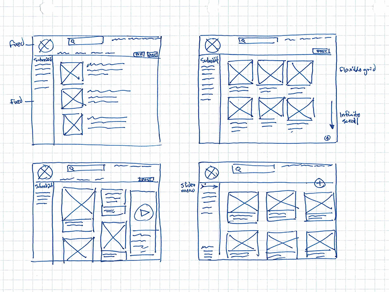
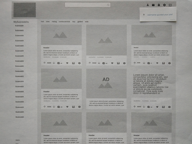
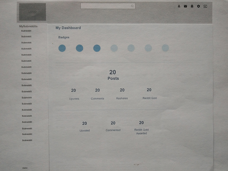
Discovering the Problem
Heuristic Evaluation
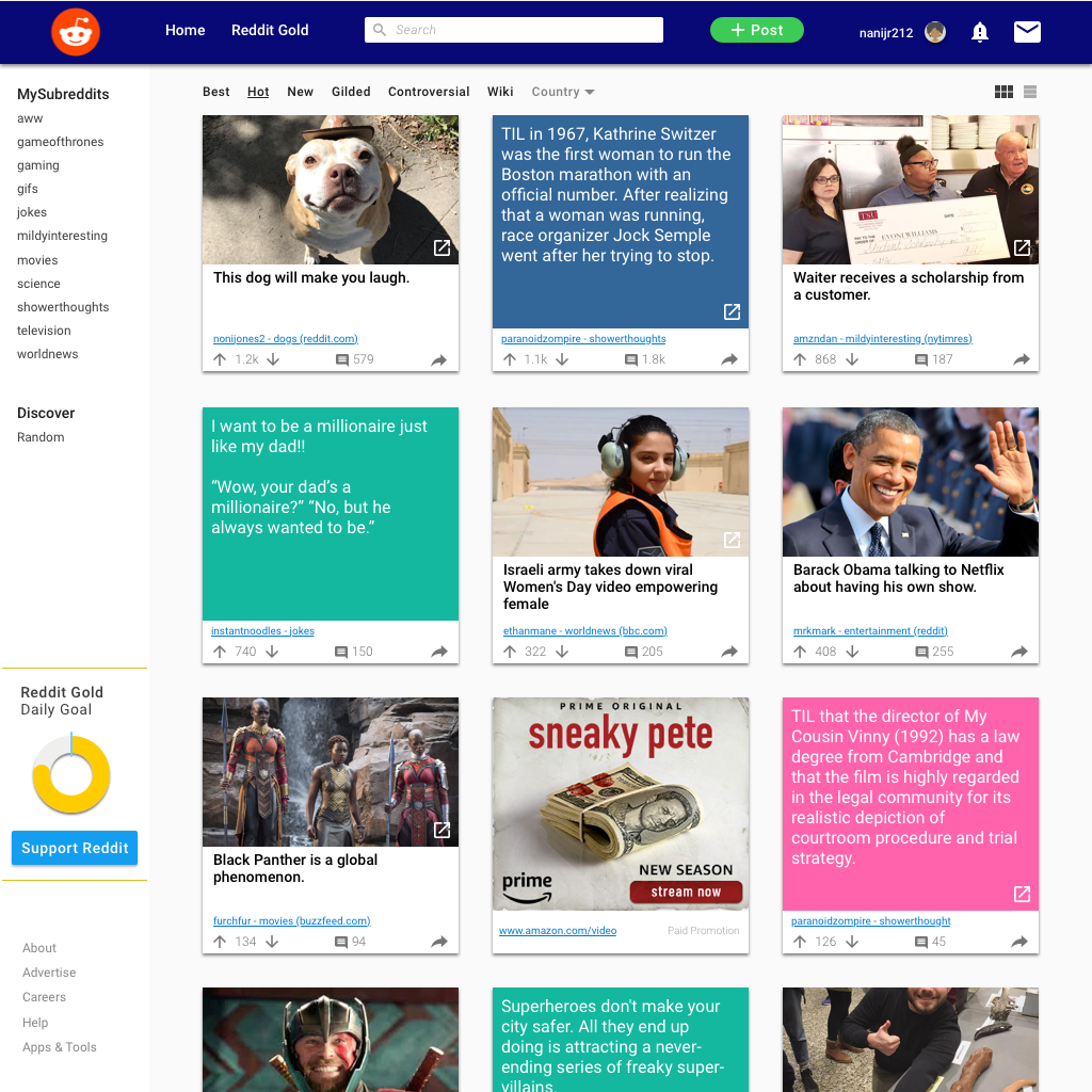
Consistency and standards
Primary menu lacks visual hierarchy: font is too small and unbolded, inconsistent headers and navigations between subreddits.
Match between system and the real world
Changing the language from English only updates a small portion of the website - not all the content.
Aesthetic and minimalist design
Reddit.com has a cluttered and very busy design. Weak visual hierarchy.
Recognition rather than recall
The “Submit a new link” and “Submit a new text post” buttons are hidden between advertisements.

Buttons to post content are hidden